Headers
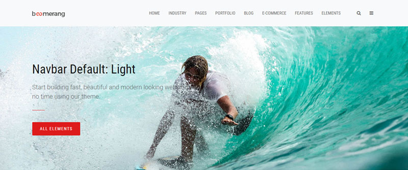
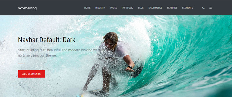
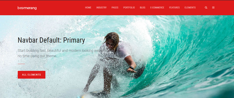
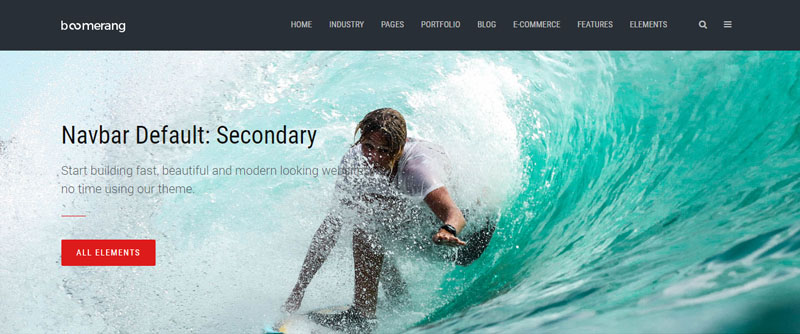
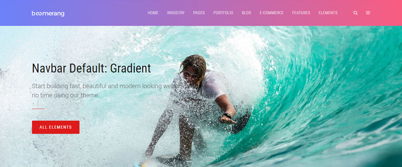
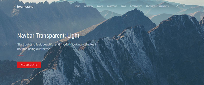
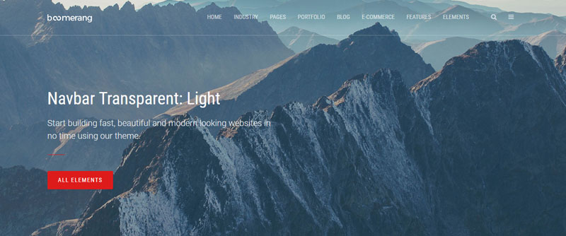
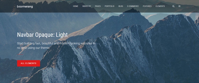
Boomerang is a powerful website template with components built for maximum flexibility. It comes with 30+ header styles including many color, placement and alignement options and navbar components.
Default headers

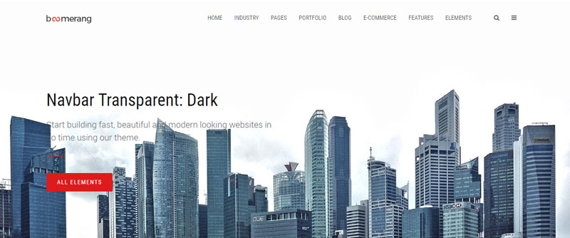
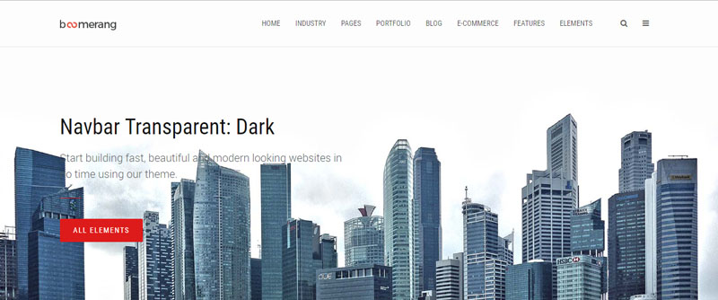
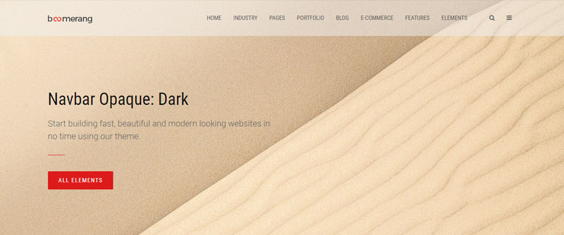
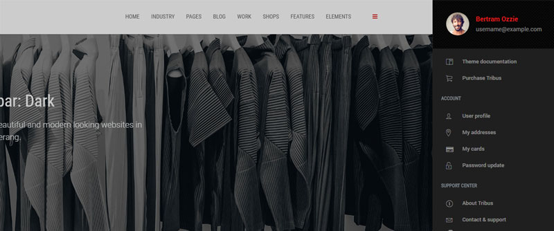
Transparent & Opaque
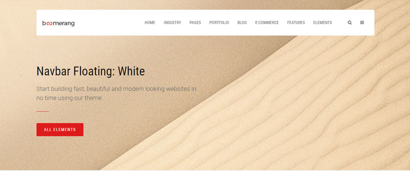
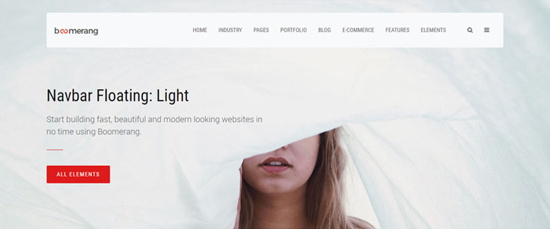
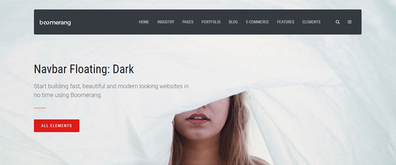
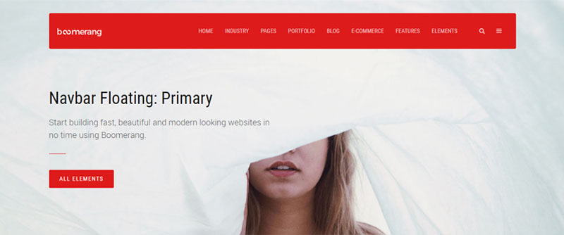
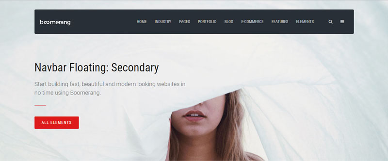
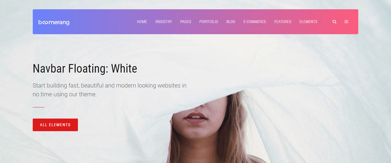
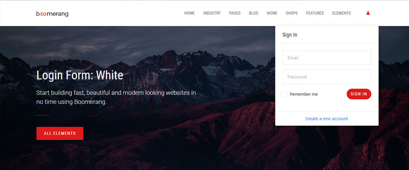
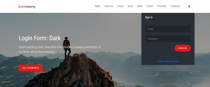
Floating
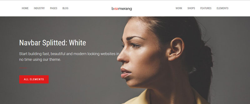
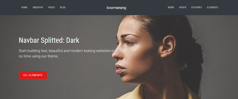
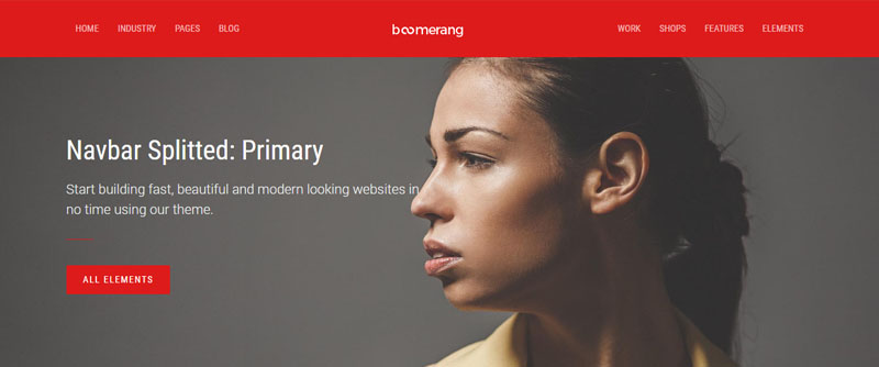
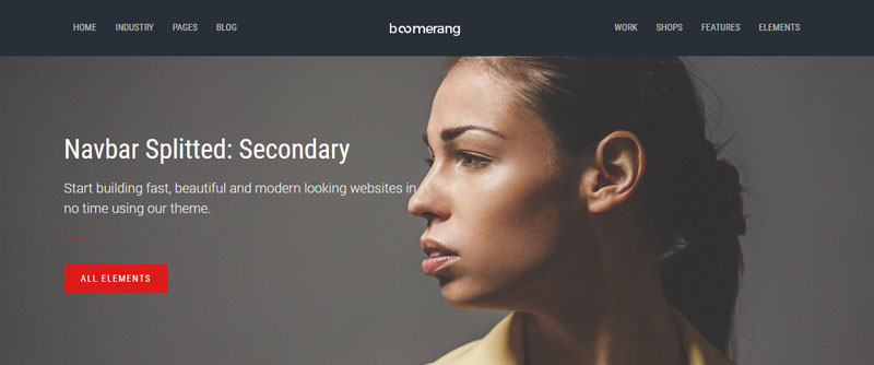
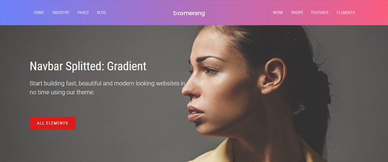
Splitted
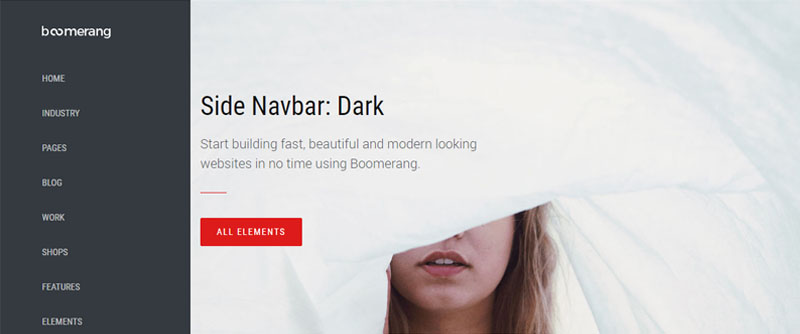
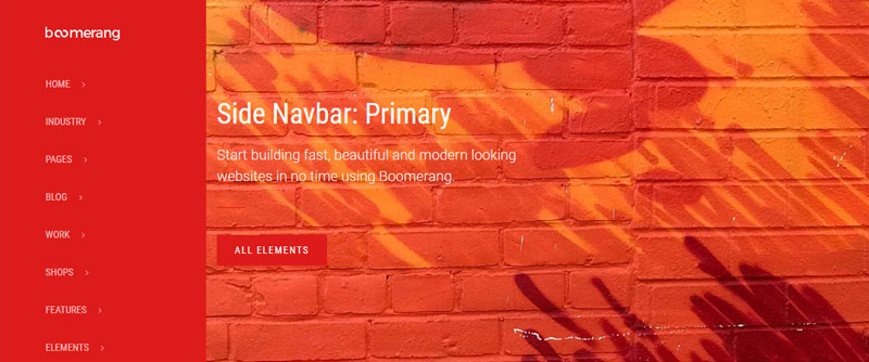
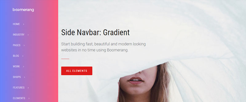
Sidebar


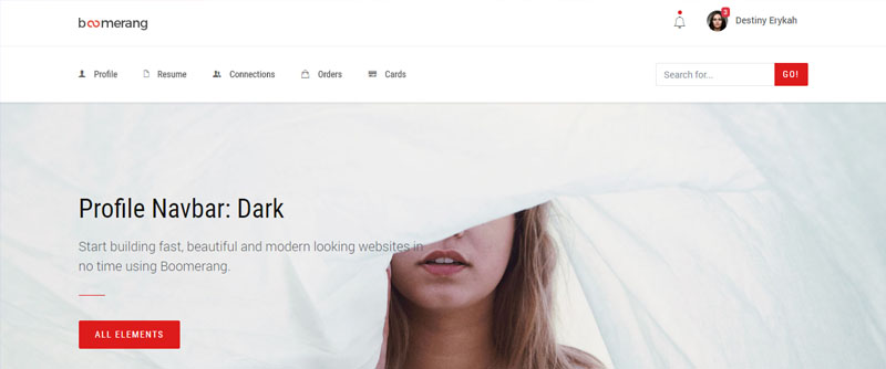
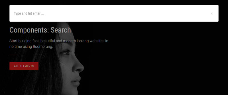
Components

Options
All the options are applicable for any navbar element. The following modifier classes must be
added on the .navbar container. Almost all options can be seen by using the style switcher from
available on the preview mode.
Modifier classes
| Option | Description |
|---|---|
.navbar--style-1 |
Change the navbar's style without modifying the markup. |
.navbar--style-1 |
Another variation that changes the navbar's style without modifying the markup. |
.navbar--shadow |
Add a shadow at the bottom of the navbar for creating a depth effect between the header and the body. |
.navbar--shadow-inset-1 |
Add a shadow in the interior of the navbar's container. |
.navbar--bb-1px, .navbar--bb-2px and .navbar--bb-3px |
Add a border delimiter at the bottom of the navbar. You can choose a thickness from 1px to 3px. |
.navbar--bold |
Make the navbar item's font weight bolder. |
.navbar--uppercase |
Make all the letters from the navbar's items uppercase. |
.navbar-dropdown--inverse |
Change the dropdown's background. By default it changes to a dark color. |
Placement
Choose from fixed to the top, fixed to the bottom, or stickied to the top (scrolls with the page until it reaches the top, then stays there). Fixed navbars use position: fixed, meaning they’re pulled from the normal flow of the DOM and may require custom CSS (e.g., padding-top on the <body>) to prevent overlap with other elements.
Example
<!-- Fixed top -->
<div class="header">
    <nav class="navbar fixed-top navbar-light bg-default">
        ...
    </nav>
</div>

<!-- Fixed bottom -->
<div class="header">
    <nav class="navbar fixed-bottom navbar-light bg-default">
        ...
    </nav>
</div>

<!-- Sticky top -->
<div class="header">
    <nav class="navbar sticky-top navbar-light bg-default">
        ...
    </nav>
</div>
Headroom
Headroom is a lightweight, high-performance JS widget (with no dependencies!) that allows you to react to the user's scroll. The header on this site is a living example, it slides out of view when scrolling down and slides back in when scrolling up.
data-toggle="headroom" on the .header element. In case you use a top navbar, it will be automatically
hidden on scroll and shown again when the scroll reaches the top of the page.
Example
<div class="header" data-toggle="headroom">
    <nav class="navbar fixed-top navbar-light bg-default">
    ...
    </nav>
</div>
Dropdown toggle
By default the navbar's dropdowns are opened on the click of the mouse. This ensures a better functionality and user experience. However, you can opt
to toggle a dropdown on mouse hover. All you have to do is to add the data-hover="dropdown" on the .navbar-nav menu list.
Make sure to include the following script at the bottom of the page in the "Bootstrap Extension" area:
<script src="/assets/vendor/bootstrap-dropdown-hover/js/bootstrap-dropdown-hover.js"></script>
/script>
Example
<div class="header">
    <nav class="navbar fixed-top navbar-light bg-default">
        <div class="container navbar-container">
            <div class="collapse navbar-collapse align-items-center justify-content-end" id="navbar_main">
                <ul class="navbar-nav" data-hover="dropdown">
                    ...
                </ul>
            </div>
        </div>
    </nav>
</div>